![wellnesscoach-full-white-inline (4).png]](https://customer.wellnesscoach.live/hs-fs/hubfs/wellnesscoach-full-white-inline%20(4).png?height=40&name=wellnesscoach-full-white-inline%20(4).png)
1. Watch a quick overview demo video
The HR Admin Dashboard is your source of thruth for monitoring team wellbeing. This feature inside your Admin Portal provides a real-time, "at-a-glance" view of how your employees are engaging with the Wellness Coach platform.
Step-by-Step Guide: How to Access Your Dashboard
Accessing your reports is simple. Follow these steps to navigate to your data:
1. Log in to your Admin Portal:
-
Log in at https://portal.wellnesscoach.live.
-
Enter your login credentials
-
Type in your work email address.
- Click Continue
- Follow your company's progress according to your company's set-up.
-
You will now be redirected to your Admin Portal landing page (Learn more here)
-
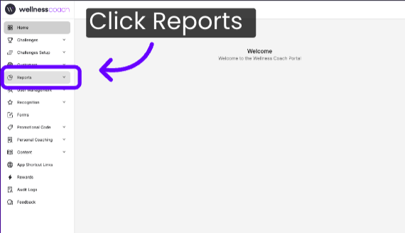
2. In the left-hand navigation menu, click on Reports.
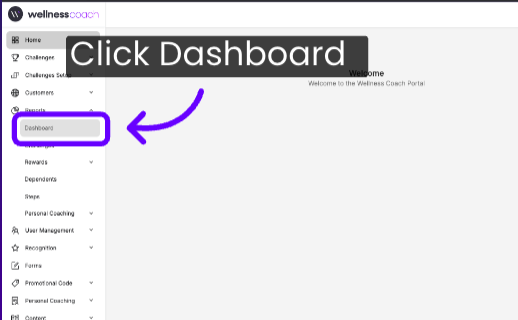
3. Select Dashboard from the dropdown menu.
4. Welcome to the Wellness Coach Advanced HR Dashboard, available 24/7 in your Admin Portal. Use this dashboard to explore key insights on program adoption, employee engagement, and industry benchmarks.
.png?width=670&height=373&name=HR%20Dashboard%20Demo%20Sales%20Video%20(1).png)
On the top right side, you can: Filter reports by "Start to End Date" and also the capability to download reports in PDF.


-
Topline Summary:
Your dashboard is designed to be intuitive, using visual data to help you track four primary pillars of engagement
-2.png?width=644&height=378&name=Untitled%20design%20(7)-2.png)
-
Wellness Score: This score combines adoption, engagement, support follow-through, and healthy habit signals across the parts of the program included in this plan.
-
Total Active Users: Highlights the percentage of registered users who are currently engaging with the tool (e.g., "50 out of 54" or 93%).
-
Effectiveness: Represented as a percentage, this shows the overall satisfaction or positive impact rating reported by your team members. A "100%" rating indicates highly positive feedback from the users.
-
Newly Activated: A donut chart that distinguishes between employees using the platform for the first time and those who are returning, helping you measure long-term retention.
-
Adoption: Measures registered users as a percentage of the eligible population, so it's tracking how many people have signed up relative to who's eligible, not how actively they're using the program
- Engagement Minutes: The total number of minutes tracked across all activity on the platform during the reporting window, a raw volume measure of how much time people spent engaging, rather than how many people engaged.
- Completed Coaching Sessions: This displays the number of one-on-one personal coaching sessions your team has engaged in during the selected period.
- Challenge Participants: This counts the total number of wellness challenges your team members have joined.
-
-
Highlights:
Detail cards on wellness score, active-user rate, newly activated users, registrations, eligibility, and engagement minutes that unpack overall health and participation and point leaders to where to focus next, building on the summary numbers shown in Topline.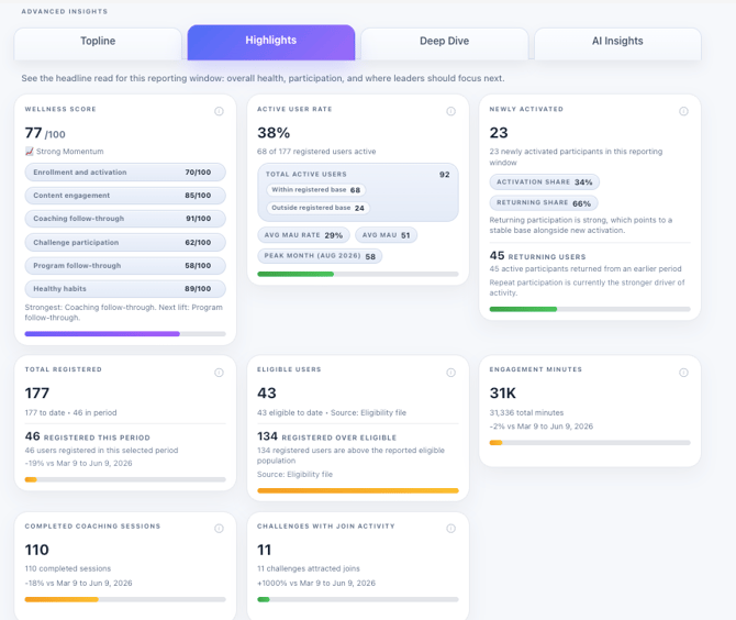
-
Deep Dive:
Inside Deep Dive, you'll find several tabs including Performance, Themes & Impact, and Benchmarks, where you can review your report by performance, participation, programs, benchmarks, people, and impact, and break down this detailed information directly within each section.
-
Performance:
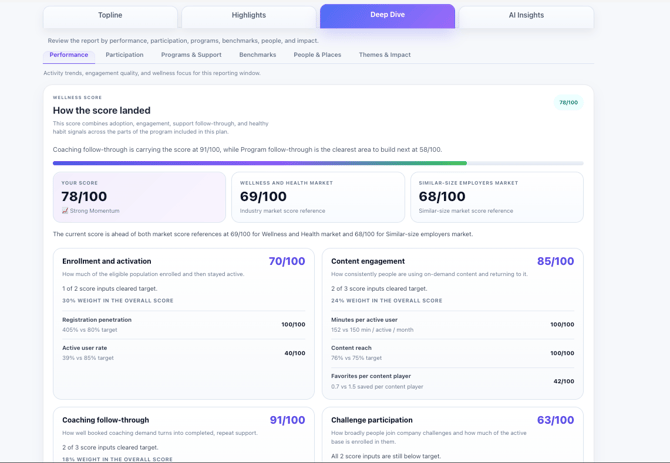
At the top, your Wellness Score breaks down into key drivers—including enrollment, content engagement, coaching follow-through, and healthy habits—giving you instant visibility into what shapes your score. Beside it, the Active User Rate measures true engagement, while auto-generated callouts automatically highlight your top win and biggest growth opportunity without requiring any manual data crunching.
-
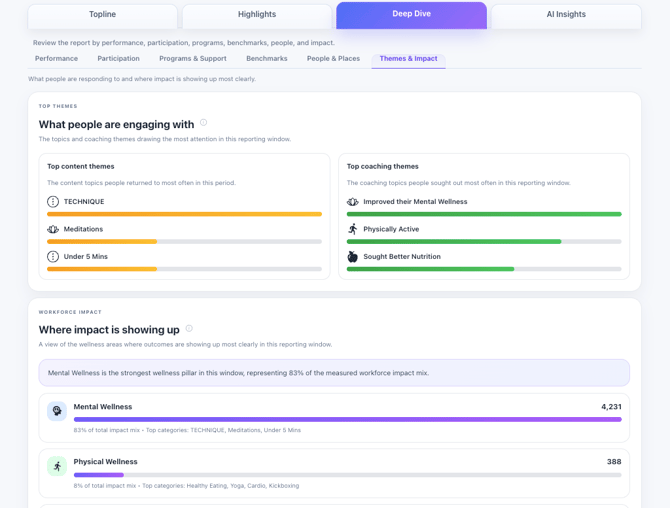
Themes & Impact:
-
This tab highlights what your workforce cares about and where it drives results. The Top Themes panel ranks your team’s favorite content and coaching topics, while the Workforce Impact section translates that engagement into measurable outcomes. By automatically highlighting your leading wellness pillar—such as Mental, Physical, or Workplace Wellness—this tab clearly showcases the tangible impact of your program.
-
Benchmarks:
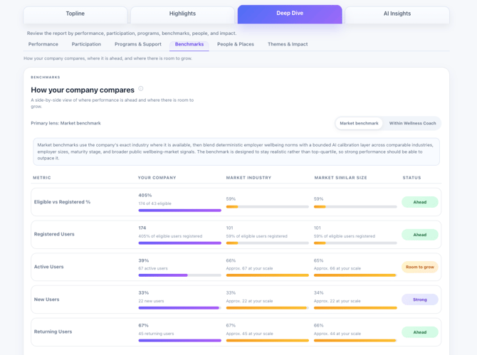
This tab allows you to evaluate your program's performance against the broader market. Use the Lens Toggle to compare your metrics against industry peers or the entire Wellness Coach customer base, while the Methodology Callout details how these calculations are made. Additionally, the Metric Comparison Table features side-by-side progress bars and status badges such as "Ahead" to help you instantly identify where your program is outperforming market benchmarks.
-
3.AI Insights:
This tab simplifies reporting and deep-dive analysis into your program's performance. The Executive Brief generates a plain-language summary of your overall progress for quick leadership updates, while the Workforce Intelligence Agent allows you to ask specific questions—such as "What drove our engagement surge this month?"—to instantly receive data-backed answers.
-2.png?width=670&height=439&name=Untitled%20design%20(8)-2.png)
Support
Live Video Support
Schedule a live support session with our team for real-time, face-to-face help whenever you need it.
Learn more about how to book
[Book live support]
Email Support
Reach out to support@wellnesscoach.live for assistance. This contact is also available directly inside the app. Responses may take up to 24 hours.
[Email us]